By Joe McCullough
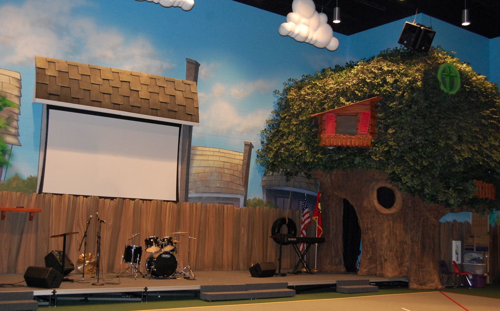
Since the turn of the 21st century, churches across the world have embraced the idea of theming children and youth spaces to attract new visitors and foster community through intentional, purpose-driven design that teaches Biblical truths in a fun, visually rich environment.
As facilities grow in size and popularity, it is vitally important to invest finances wisely and avoid costly mistakes.
Here are the top four mistakes made by churches today that you should avoid:
- Recreating a theme just because it worked for another church
Theme selection is a very personal decision for a church, and it should take into account your location, your audience, the age of the students you are reaching and their interests collectively.
It works best to ask your youth for opinions on theme environments before launching into the build process. They will tell you what gets them excited and be advocates for the successful outcome if you value their opinion.
- Thinking the theme has to match the church stationary
This decision has more to do with the adults and the church marketing plan than with providing an exciting learning environment for the kids.
While it can work to both design the environment for your target audience and blend the graphics with the corporate brand identity of the church, more often than not, one voice drowns out the other.
However, a skilled design team can carefully distill the core values of the church and infuse those values into the theme design, allowing for both a cohesive design package and an educational foundation that supports the church mission while maintaining visual interest for the intended audience.
- Decision by committee
Trying to involve each leadership member creates buy-in with a grand vision and ensures that core values are communicated and understood.
However, expecting each leader to provide an equal number of ideas or trying to represent an equal portion of ideas in a theme in the name of fairness does not always produce the best results.
Instead of relying on staff to “design” the space, ask your staff for descriptive words that inform the designer of the desired outcome.
Phrases like “lively, energetic, open for large gatherings or cozy for small groups” would set the boundaries for design while still maintaining freedom to create a cohesive environment.
- Thinking the theme has to be turned up to 11 all the time
It is important to give a themed space a hierarchy. Entryways and large group gatherings are prime candidates for immersive design elements since most of the audience experiences these spaces every week.
Classrooms and smaller, more intimate settings need to dial back the “loudness” and excitement level of a theme as a visual cue to focus more attention on the instructor. Lighting plays such a big role in this endeavor, and it is often an overlooked expense for churches.
Joe McCullough founded Theme Fusion in 2006 as a themed environment design service catering to churches and the needs of ministry to reach children and youth. They are committed to creating high quality themed environments, 3-D props, signage and murals to enhance the educational or entertainment value of family destinations, www.themefusion.com.


